The Villa Savoye – Visited in September 2013

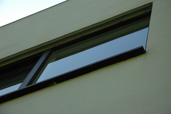


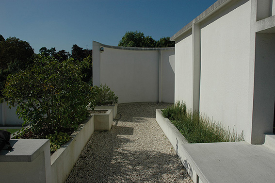


The Villa Savoye – Visited in September 2013
LES MASON
EPICUREAN MAGAZINE 1966-1979
30 SEPTEMBER – 14 NOVEMBER 2010
Curated by
DOMINIC HOFSTEDE
Review: Glenn Walls Published in Un Magazine Issue 5.1 – June 2011

Les Mason. Installation view, The Narrows. 2010. Photo credit: Tobias Titz
Un Magazine Review link: http://unprojects.org.au/magazine/issues/issue-5-1/les-mason-epicurean-magazine-1966%E2%80%931979/
Les Mason, an American graphic designer who moved to Melbourne in the early 1960s, spent thirteen years designing, photographing and illustrating Epicurean magazine, Australia’s first magazine devoted to food and wine. In September 2010, contemporary art and design gallery The Narrows exhibited a survey of all seventy-seven covers, the last exhibition in its Flinders Lane location. Exhibited in purpose-built display cabinets, Masons’ covers were presented in chronological order from 1966 to 1979. This retrospective approach highlighted Masons’ employment, over several years, of the signature styles of a variety of twentieth century art movements, to create complex and innovative cover art.
In 1974, an exhibition of Mason’s paintings from Epicurean was held at Realities Gallery in Melbourne. According to Dominic Hofstede, the curator of the exhibition at The Narrows, ‘by placing the ephemeral and marginalised world of magazine graphics within the context of the art gallery Mason had blurred the lines between art and design.’[i] Hofstede continued this practice by exhibiting a small selection of Mason’s 1974 artworks alongside the covers at The Narrows. Each of these artworks had been published, either on the cover of the magazine, or as a spread.
The exhibition highlighted Mason’s most notable reference to the art movements of Dada and Surrealism. Mason utilised these movement’s irrational visual juxtapositions for maximum visual impact. In Epicurean 51 October-November 1974, he evoked Salvador Dali’s dream state imagery with a bottle cut in half leaving the top section balanced precariously. A multi-coloured egg replaces the brain on a drawing of a face similar in style to the animation used in the Beatles’ Yellow Submarine film of the late 60s. In Epicurean 71 February-March 1978, Mason continued to incorporate the style of Surrealism. Here, the bottom sections of a bottle are strategically cut away and balanced against sections of a pear and egg. These were the days long before PhotoShop, leaving one to wonder how a bottle such as this could balance. The success of Mason’s Epicurean covers lays in his ability to employ the visual styles of Dada and Surrealism to challenge the general public’s perception of how a magazine cover should look, while still promoting the ideals and products of the magazine.
In later covers, Mason moves through a variety of art movements, such as Arte Povera, spatial art, colour field painting, geometric abstraction, abstraction, pop art and op art, to name a few. Such referencing kept Epicurean fresh and unhindered by a particular corporate style guide that is often applied to well-known publications such as the fashion tome Vogue. As demonstrated in the layout of the exhibition, the overall effect suggests that no two covers are alike. Utilising various font styles for the masthead, Mason was able to inject a sense of playfulness creating an element of intrigue as to the magazine’s content.
The visual effectiveness of the covers indicates that Mason was willing to take risks offered to him by the magazine owner and publisher, Alan Holsworth. In order to produce a magazine that reflected Australia’s developing food and wine industry Holsworth afforded Mason complete creative freedom. With little or no budget, Mason was able to incorporate his many interests in a variety of art and design styles to produce a body of work rarely seen in Australian publishing. A similar comparison can be made to the creative freedom that photographer and creative director Oliviero Toscani enjoyed while at the helm of global clothing brand, Benetton, in the late 1980s and ’90s that resulted in thought provoking and sometimes controversial advertising campaigns.
The exhibition was a rare opportunity to view a comprehensive body of work from an eminent designer. Mason’s covers are landmarks in the development of graphic design both nationally and internationally. Through Epicurean Mason indulged his passion for experimentation and a comprehensive knowledge of twentieth century art styles to formulate what may be considered a defining moment in the evolution of design in this country.
Glenn Walls is an artist, writer and curator based in Melbourne.
[i] Dominic Hofstede, Les Mason’s Playground, exhibition catalogue, The Narrows, Melbourne, 2010, http://www.thenarrows.org/archive/2010/51.shtml. (Accessed 21 March 2011).
http://unprojects.org.au/magazine/issues/issue-5-1/les-mason-epicurean-magazine-1966%E2%80%931979/

Les Mason. Epicurean 44 (August-September 1973). 45 x 45 cms. Acrylic paint
Image courtesy the designer & The Narrows. Photo credit: Tobias Titz

Les Mason. Epicurean 36 (April-May 1972). Magazine cover
Image courtesy the designer & The Narrows. Photo credit: Tobias Titz
AGideas design conference is held each year to inspire students, teachers and designers working in the creative fields of communication design, film, animation, games design, dance, public sculpture, interior design, photography, architecture and a number of other creative industries. Attending the conference was an opportunity to see and listen to a number of creative professionals. Their talks ranged from stimulating to confusing, however for most their visuals were enough to translate a passion to their chosen creative discipline.
A highlight of the conference was French communication designer Fanette Mellier. Although Mellier claimed her English was not good at the beginning of the talk she demonstrated a clear understanding of the nuances of the English language to convey the main points of her practice. Mellier’s father was a printer and it was here that her love of the printed word developed.
Mellier’s practice blurs the line between visual artist and designer. This is a complex area when discussing the validity of design as art. However Mellier navigated through theoretical examples of her practice that explores the power of text (or font) as image. Through the print media Mellier employs text from literature, most notably poems and formulates each letter from a word into geometrical shapes. Colour forms an integral part. At times these works, which appear on the street in the form of posters or as installations in galleries, could be viewed as geometrical abstractions, yet in many examples the text is easy to read.
Mellier use of colour is vital to the integrity of the works. Relying mainly on primary colours Mellier uses their emotive power to form images that seem striking in their simplicity. However as Mellier demonstrated in the work Specimen they are complex in their making. Utilising the process of silk screening enables Mellier to individually alter prints thus removing the mass production element in her work.


Fenette Mellier
Specimen, 2009 (Left)
Fontenew, 2007 (Right)
Mellier theoretical approach to her practice inspired me to contemplate a means of incorporating some of her ideals into lectures on the meaning of text and how we visualise the written word. Her approach to methods of production and innovative exhibitions will hopefully inspire students to think of ways to approach there own practice and what its means to be a designer in the twenty first century.
Lecturing in design history and contemporary design practice. I am always searching for designers/artists who have a theoretical based practice that they adhere too. Japan’s Ken Miki is such a designer. Miki practice fosters the idea that language through design can be universally understood. Hence design can ‘cross cultural boarders and create shared feelings. He likes to employ emotion in his designs and greatly enjoys incorporating witty tricks, such as skillful visual illusions, into his posters, packaging, building signs and other projects.’[1]
Miki spoke in Japanese, occasionally crossing over into English. Through the use of subtitles it was easy to follow Miki’s argument. Miki design work follows in the tradition of Japanese minimalism. However his work goes beyond the visual by incorporating tactile elements to ‘inspire our five senses like rhythmic lyrics and extend beyond time and dimensions to reveal the possibility of communication with the subconscious’.[2]
Miki is a designer that students can learn a great deal from. His practice reinforces the notion that visual clutter is poor for the mind and soul. His work Money does not make you happy is an exceptional example of his minimalist approach to thinking and practice. These ideals I will be incorporating into a type project next semester.

Ken Miki/Stefan Sagmeister
Money does not make you happy
2005
AGIdeas eclectic mix of presentations over the three days provided some thought provoking ideas. Some reflected on the cynicism within the advertising industry, as Adam Hunt talk demonstrated, whilst most preferred to focus on the power of design to change the way we think and operate. The positive nature of these talks is what design is about. It is also an attitude that needs to be fostered if we are going to keep our students and grow our design courses.
